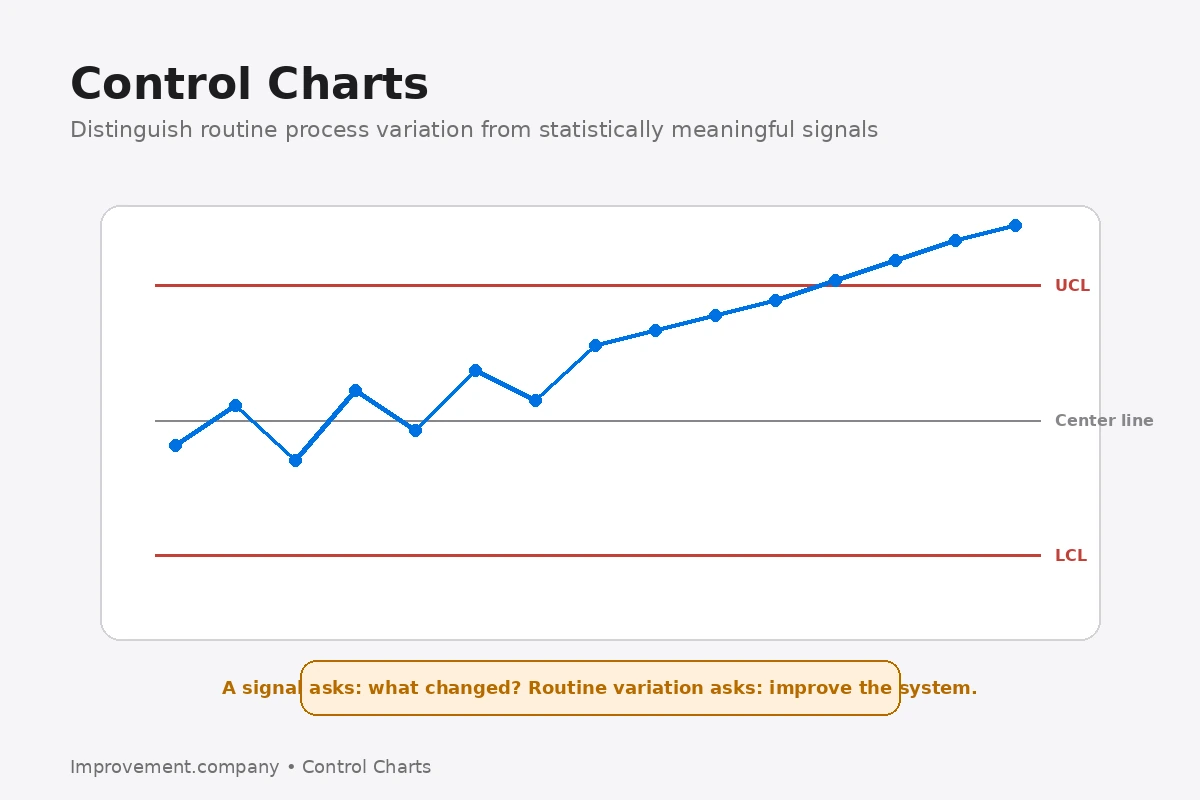
A control chart is a statistical tool used to understand process variation over time.
It helps distinguish between common-cause variation that is inherent in the current process and special-cause variation that suggests something meaningful has changed.
Why variation matters
Every process varies.
Measurements differ from cycle to cycle, unit to unit and day to day.
The important question is whether the variation represents the normal behavior of the current system or evidence of an abnormal condition.
Center line and control limits
A control chart typically includes:
- a center line representing process location;
- an upper control limit;
- a lower control limit.
Control limits are calculated from process data.
They are not the same as specification limits.
Specifications describe what the customer or design requires. Control limits describe how the process is behaving.
Common cause
Common-cause variation comes from the process as it is currently designed and managed.
Reacting to every normal fluctuation can make performance worse.
Special cause
A special cause indicates that something unusual may have affected the process.
Examples can include equipment changes, material differences, setup errors or unusual environmental conditions.
Signals are not limited to points outside control limits. Patterns and runs can also indicate a change.
Control does not mean capability
A statistically stable process can still produce output outside customer requirements.
Stability and capability answer different questions.
First understand whether the process is stable. Then evaluate whether its performance is capable of meeting requirements.
Choose the chart for the data
Different control charts are designed for different types of data and sampling situations. Measurements such as dimensions or time require a different approach from counts of defects or proportions of nonconforming units.
The chart should therefore be selected from the structure of the data, not from preference. Consistent sampling and clear operational definitions are also important; otherwise the chart can reflect changes in measurement practice rather than changes in the process.
Common cause and special cause variation
Control charts help distinguish variation that is inherent in the current process from signals that suggest something unusual has changed.
Common cause variation reflects the system as it normally operates. Special cause variation points to a specific condition that is not part of the usual pattern.
This distinction matters because the response should be different.
Investigating every ordinary fluctuation can create unnecessary adjustment. Ignoring a real special cause can allow an abnormal condition to continue.
Control limits are not specification limits
Control limits describe the behavior of the process from process data.
Specification limits describe what the product, service or customer requirement allows.
A process can be statistically stable and still fail specifications. It can also produce within specification while showing instability that makes future performance unpredictable.
Capability analysis and control-chart analysis answer related but different questions.
Avoid tampering
One of the risks in process management is adjusting a stable process in response to normal variation.
Repeated unnecessary adjustments can increase variation rather than reduce it.
A control chart provides a disciplined way to decide when the process has produced evidence of a meaningful change.
The chart should support better decisions, not simply display historical data.
Connect this concept to the wider system
For deeper application, connect this concept with DMAIC and FMEA. These methods help move from understanding the topic to managing it as part of a wider improvement system.
Related application
This topic also connects with Statistical Process Control. Use that method when the improvement requires the related operating or management discipline.
Related application
This topic also connects with Control Limits vs Specification Limits. Use that method when the improvement requires the related operating or management discipline.