
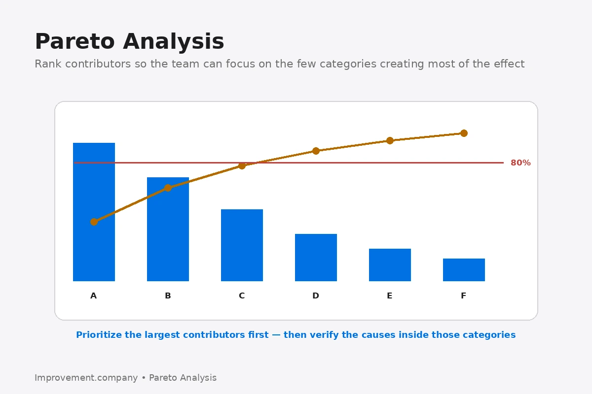
Pareto analysis is a method for ranking categories so a team can focus attention on the problems or causes that contribute the greatest impact. A Pareto chart typically displays categories as bars in descending order, often with a cumulative percentage line.
The method is associated with the Pareto principle, sometimes described as the 80/20 rule, but the exact percentage is not the point. Real data may show a different distribution.
The value comes from separating the significant few categories from the many smaller contributors.
Define the measure first
A Pareto chart is only as useful as the measure behind it.
Teams may rank categories by frequency, cost, downtime, defect quantity, delay or another meaningful impact measure.
Those choices can lead to different priorities.
A defect that occurs rarely may still deserve immediate action if its safety or customer impact is severe.
Use mutually understandable categories
Categories should be defined consistently.
If one person records a defect as “surface damage” and another records the same condition as “scratch,” the data can split one problem into several bars.
Clear operational definitions improve the reliability of the analysis.
Build the chart
The usual approach is to total the selected measure for each category, sort categories from highest to lowest and calculate cumulative contribution.
The resulting chart makes concentration visible.
If the first few categories account for most of the impact, the team has a practical place to begin deeper analysis.
Pareto does not identify root cause
A Pareto chart may show that one defect type is responsible for most customer complaints.
That does not explain why the defect occurs.
The high-priority category should become the subject of further problem solving using methods such as Gemba observation, fishbone analysis, 5 Whys, process data or technical investigation.
Pareto is a prioritization tool, not a cause-verification tool.
Stratification can reveal hidden patterns
A broad Pareto may hide useful detail.
The team can stratify the leading category by machine, shift, product, supplier, location or another relevant factor.
A second Pareto at that level can reveal where the problem is concentrated.
This is particularly useful when the overall category is too broad for action.
Common mistakes
One mistake is treating the cumulative 80 percent point as a mandatory cutoff.
Another is combining categories with very different severity into one count-based chart.
A third is using poor-quality data with inconsistent category definitions.
Teams should also avoid creating endless Pareto charts without moving into problem solving.
When to use Pareto analysis
Pareto analysis is useful when a process has many defect types, downtime reasons, customer complaints, causes of delay or other categories competing for attention.
It helps the team decide where focused investigation is likely to produce the largest benefit first.
Used well, Pareto analysis converts a long list of problems into a visible priority sequence while keeping the underlying decision grounded in data.
How Pareto Analysis connects to problem solving
Pareto Analysis helps decide where deeper investigation is most valuable. In DMAIC, it can help prioritize categories during Measure and Analyze; in 8D, it can focus the team on the dominant problem families; and Root Cause Analysis takes the next step by investigating why the selected problem occurs.
Related application
This topic also connects with 7 Basic Quality Tools. Use that method when the improvement requires the related operating or management discipline.
Related application
This topic also connects with Problem Stratification. Use that method when the improvement requires the related operating or management discipline.